How to Read a Forest Plot
Scientific studies often use a graphical expression of data called a forest plot. It can be employed in a variety of ways but is probably most frequently used to graphically express the findings in a meta-analysis of the pooled data from several individual studies.
A meta-analysis uses statistics to interpret the data from a collection of studies. Although a meta-analysis sometimes suffers from a systematic error related to selection bias (i.e. “cherry picking” the studies) when the studies are objectively chosen it has the ability to bring clarity to a group of randomized controlled trials that may have been “underpowered” (typically because there were too few participants in the studies). By pooling the data, a meta-analysis can reach statistical significance on an examined variable even when the individual studies did not.
Let’s use forest plots from a published study to illustrate our explanation. The first image is a forest plot from a study examining the effect of exercise on known biomarkers for CVD risk. It includes a meta-analysis.
The question presented in the meta-analysis was whether the pooled data from all the studies supports the hypothesis that exercise will reduce the number of small LDL particles (small LDL-P) and whether it will increase the number of large LDL particles (large LDL-p). Why is this of interest? Because a lipid profile with a preponderance of large LDL particles (dubbed an A phenotype) versus a preponderance of small LDL particle (dubbed a B phenotype has been shown to present a lower risk of CVD.
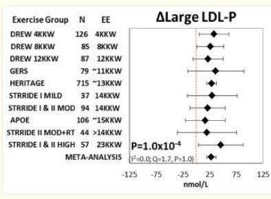
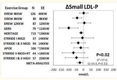
These forest plots graphically demonstrate how exercise affected the change in the number of large LDL-P particles (Figure 1) and small LDL-P particles (Figure 2) in ten separate studies and in a meta-analysis of the pooled data from the studies.
On the left is a list of the studies showing the number of participants in each study. On the same line, to the right, is a diamond, dot, or square spanned by a horizontal line that’s capped at each end. The diamond on each line denotes the mean particle number of the indicated size of particle for each study. The horizontal line spanning the diamond is a graphical representation of the confidence interval in that study. The dotted vertical line in the middle of this plot indicates the point of zero effect (no change) for each study. In some types of studies that line might be at “1”, but for the purpose of explaining the forest plot we’ll use this plot where “0” is the number.
Figure 1 is the forest plot graphically showing the mean increase or decrease of large LDL-p for each study. Because the diamond on each line is to the right of zero, that means that in each of the studies there was a mean increase in large LDL particles. When the line spanning the diamond crosses the dotted line it means that the finding denoted by the diamond on the line was not statistically significant. In a scientific study, this means that the hypothesis failed because the level of confidence required was not met. As you can see, in six of the 10 studies in this forest plot the horizontal line (the confidence interval) crosses the line of no effect. This means that the result was not statistically significant in that study. Only four studies, Drew 4KKW, Drew 8KKW, Heritage and Stride I & II High show horizontal lines that do not cross the line of no effect. These four studies are the only four studies that found that the increase in large LDL was statistically significant.
Figure 2 is the forest plot graphically showing the mean increase or decrease of small LDL particles (small LDL-p). Only the Drew 8KKW, Gers and Heritage studies in this plot do not cross the point of no effect. Accordingly, these are the only studies in this analysis that showed a statistically significant decrease in the number of small LDL particles (small LDL-p).
Now let’s take a look at the power of pooling the data from all ten studies. Without doing a meta-analysis on all the pooled data we have nothing more than several studies with conflicting data. By pooling the data the total number of participants is now much larger and the confidence levels are not as wide. The meta-analysis results are displayed on the bottom line of each graph.
The pooled data in Figure 1 indicates that there was an increase in large LDL particle size of about 25 nmol/L and on that line the confidence interval does not cross the dotted line and is much narrower than the horizontal line for each individual study. Both ends of the line spanning the diamond lie to the right of the dotted line. This means that exercise did significantly increase the concentration of large LDL particles in the participants.
Similarly, even though the results for reduction in concentration of small LDL particles did not reach the level of statistical significance in seven of ten studies when viewed individually, in the meta-analysis of the data, shown on the bottom line of Figure 2 there was a statistically significant reduction in the number of small LDL particles.
Forest Plot Variations
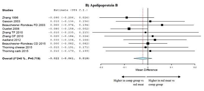
There might be variations in the way the forest plot is presented. For example in the following forest plot the meta-analysis of the data is shown as colored parallelogram that spans the vertical no effect line. In this forest plot the dotted line, rather than showing the line of no effect shows the mean for all the data. The line of no effect is the blue vertical line in this forest plot as it shows the “0” at the bottom of that line. In this method of display the width of the parallelogram is the confidence interval displayed as a shape rather than line. The peak in the center of the parallelogram is graphical display of the mean of the pooled data. That peak in the shape is the equivalent of the dot or diamond in the three forest plots in the first part of our explanation.
Sometimes, if you don’t have a keen eye, it’s difficult to see whether one end of the confidence interval is slightly to the left or right of the vertical no effect line due to lack resolution of the plot. Sometime the plot in the left column will provided the actual statistical data for each study and almost always the meta-analysis at the bottom of plot will show it for the pooled data.
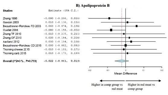
The Ouellet 2008 study is a perfect example. It’s difficult in the forest plot graph to see where the confidence interval ends. It’s extremely close to the vertical “no effect” line. But in the left column we see -0.080 (-0.158, -0.002). The numbers in parentheses are actual beginning and ending point of the confidence interval. If both numbers are either positive or negative, then the result (the number to the left of the parentheses) is statistically significant (meaning we are confident it was not caused by chance). If both numbers are either positive or either number is zero, the result is not statistically significant.
So there you have it. You now have a tool to help you untangle the complicated world of science.